Graphical Misrepresentations
Don't be fooled by the visual lie. Learn to spot deceptive data practices like truncated axes, misleading scales, and the 3D pictograph trap.
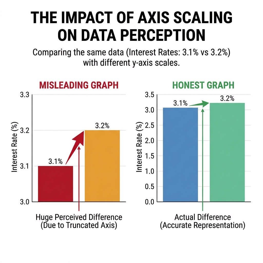
The Truncated Axis (Non-Zero Origin)
The Deception
Starting the vertical axis at a value other than zero. This exaggerates differences between groups, making small changes look massive.
Scaling & Proportions
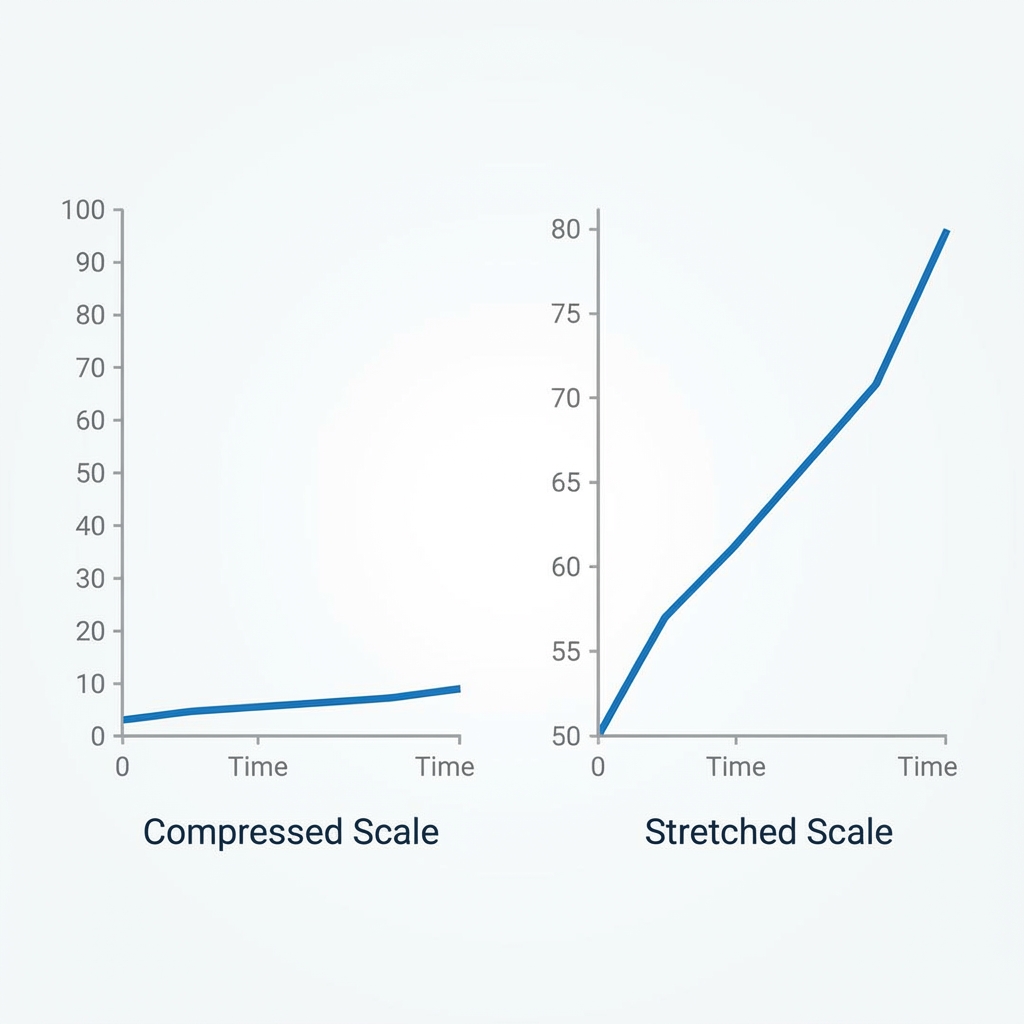
Manipulating Perception
By stretching or compressing the axes, you can manipulate how a trend is perceived ("panic" vs. "stability").
Makes a volatile stock look stable and "safe".
Makes a stable growth look like an unstoppable extreme "boom".
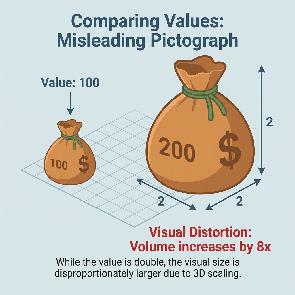
The Pictograph Problem
3D Objects in 2D Space
Using pictures (like money bags, oil drums, or houses) instead of bars is visually appealing but mathematically deceptive.
If you double the height of a 3D object to show "double" the data, you also automatically double the width and depth.
Your eye sees 8 times more "stuff", misleading you to think the increase is huge.
The Honest Graph Checklist
Clearly states what the graph represents.
Axes are labeled with variables vs units.
Starts at zero (or is clearly continuous) w/ uniform increments.
Cites where the data came from.